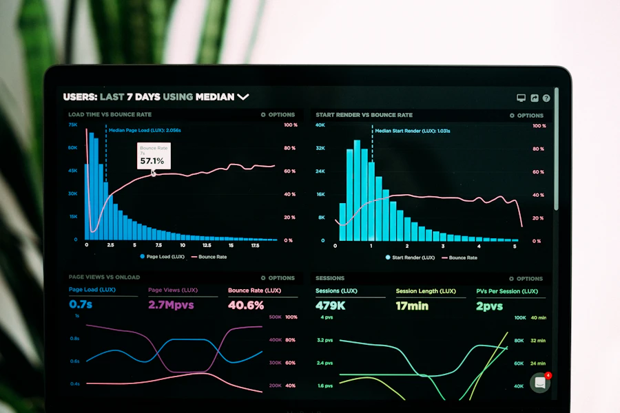
Pulse Map Intensive
Build a defensible measurement system for a live or imagined health app, from sensor ingest to stakeholder narrative.
Roi Et faculty · Health App Analytics
We train product managers, data partners, and digital-health founders to turn wearable streams, onboarding events, and clinical check-ins into decisions — not wallpaper charts.

Voices from recent seats
“The wearable ingest lab finally forced our team to stop treating step counts as a north star. We rebuilt the Pulse Map event dictionary around medication windows instead.”
“I came for dashboards. I left with a PDPA-aware telemetry plan I could take to legal without blushing. The SQL recap week still felt thin for me.”
What the faculty actually teaches
We do not certify you on a vendor. We teach you to interrogate sensors, onboarding, and clinical workflows until the numbers answer a product question.
Name events the way care teams speak. “Session start” is rarely the story; “dose logged within 90 minutes of reminder” often is.
Heart-rate, sleep stages, and glucose traces arrive noisy. You will learn when to downsample, when to keep the spike, and when to throw the day out.
Onboarding week is not week one of illness. Pulse Map students map first-dose, first-symptom log, and first missed refill as separate doors.
If a metric cannot be explained to a physician advisor in one breath, it does not ship. That rule is written into every critique.
Catalogue preview
Build a defensible measurement system for a live or imagined health app, from sensor ingest to stakeholder narrative.

A short desk audit of engagement after clinical onboarding — reminders, refill loops, and drop-off after week two.
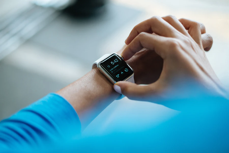
How to brief executives and physician advisors without drowning them in sparklines. Offered as a remote Signal Briefing.
A week on Pulse Map
Async reading on one measurement failure — often a real Southeast Asian health app, names removed.
Live studio: you bring a chart or an event list; faculty and peers tear the assumptions, not the person.
Written critique due. No slide theatre. A two-page memo that a medical advisor could mark in the margin.

From the journal
A short essay on why composite sleep scores collapse the very variance clinicians care about — and what a Health App Analytics team should show instead.
Roi Et · Thailand
Write to the desk with a one-paragraph product sketch. We reply within two working days and will tell you honestly whether Pulse Map, a desk audit, or a briefing is the better door.